
Earlier in the year when I was airbrushing everything that wasn’t nailed down, I had a chance to blow through my Cypher Lords warband from the Warhammer Age of Sigmar game Warcry. These truly weird chaos cultish warband really pushed the idea of what a chaos twisted band of followers could look like. From the outside they could easily pass as a mystical band of martial artists with a fancy for elaborate headgear. Of all the warbands released the look of this warband I found the most intriguing. With their true allegiance in disguise, it leaves the age-old fear of what makes chaos the scariest, the Enemy Within! Brainstorming the idea was the easy part, next was to get that idea a color scheme.
One Christmas years ago I ended up purchasing Cultist Simulator during the annual Steam Winter Sale. While the game was a solid so-so it did remind me of back on a previous time in Afghanistan. During that trip I had plowed through a collection of H.P. Lovecraft books. While some of his stories are considered relatively lame by modern standards there are plenty that can really evoke the ideas of terror unknown. The King in Yellow ended up being my inspiration for the warband. Although the collection of short stories in The King in Yellow is not written by Lovecraft, researching about him is what led me to it. Not much is really known about the “King” but apparently learning or seeing him/it is enough to drive a person insane. Yellow doesn’t seem like a malevolent color in my mind, so it is yet another addition to my Enemy Within idea. Casey provided the idea to name the warband the ‘The Court of the King in Yellow’ and I must admit he knocked the name out of the park.
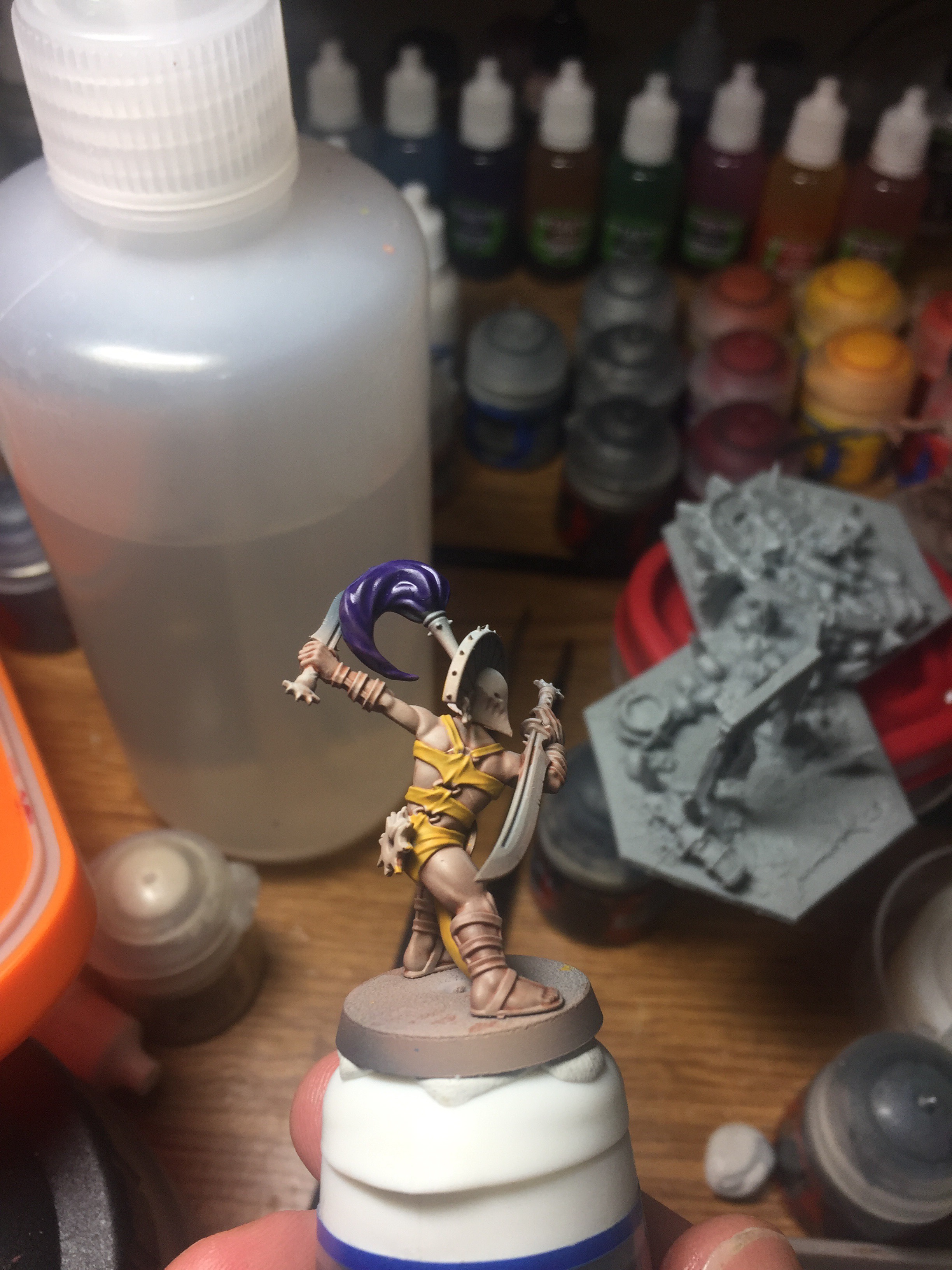
I actually enjoy painting with yellow since GW came out with their Averland Sunset paint. In the past yellow was a huge pain and took endless amounts of coats to get a solid color. This paint though works like a charm, and I find the coverage to be excellent. By spraying the skin tones first I was left with the difficult task of having to paint extra careful on the robes. This was not easily accomplished with all the spaghetti straps the model seemed to have. On the helmet I originally experimented with color-shift paints. I was hoping to get some special hue changes on the flat portions of the helmet but color-shift doesn’t work well on smooth panels. Instead, I opted for a nice robust gold using GW’s Retributor Armor.
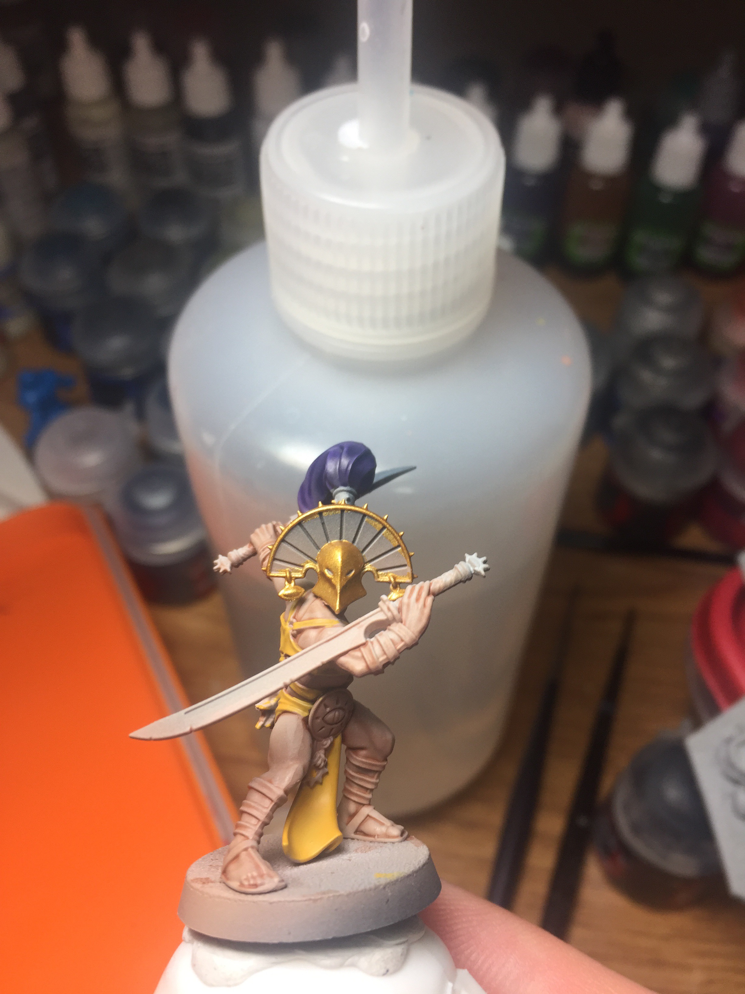
Consulting the color wheel for a good contrast color I was presented with purple as the ‘correct’ selection. I’m not an expert on color theory but since the color wheel is considered the expert, I went with Naggarroth Night on the ponytail darkened down with a Druchii Violet. At this point I wasn’t sure if purple was going to go the distance. I’ve heard over the years that a color should be in three different places on your model to be noticed. Being the complimentary color, I wasn’t sure if just the ponytail was enough for this 100% correct color choice to get noticed.
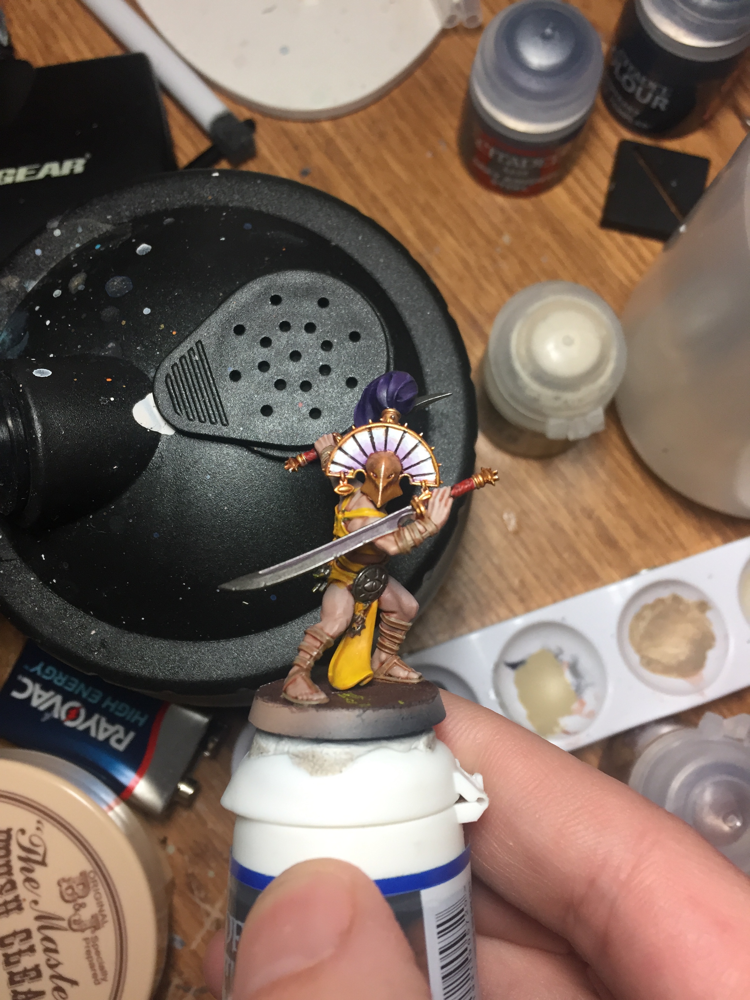
For the roman style sandals and arm straps, I used a dessert tan color which in the end I feel it was a poor choice. Steel legion drab was one of the colors used in the skin recipe through the airbrush so in my mind the straps are too similar in hue to the skin in some places. For the metals I went with the typical GW metals with a normal Nuln oil wash and highlight. I tried a few colors on the headdress until finally going with a solid white with black lines painted into the gaps for extra contrast. To offer more interest to the boring white panels I attempted to create a purplish fade with more Druchii violet.
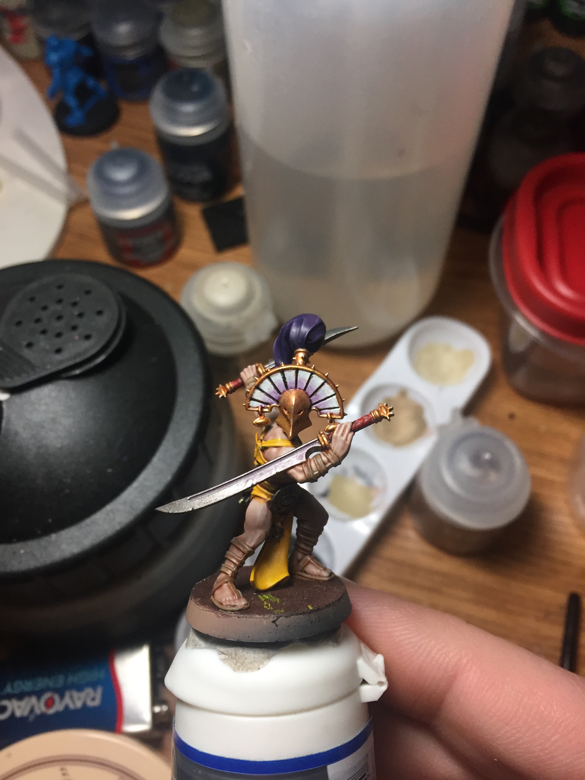
For the sword wraps and trinkets I again turned to the Professor Color Wheel to see what complimentary colors I could use. It mandated I go with red and blue so I put them to use. I painted the hand wraps on the swords red and put the blue to use on the eye talismans that the Cypher Lords are known for. To push a little more purple on the model I added a very subtle purple wash on the weapons to give them that extra bit of unknown creepy. After that it was on to the basing.
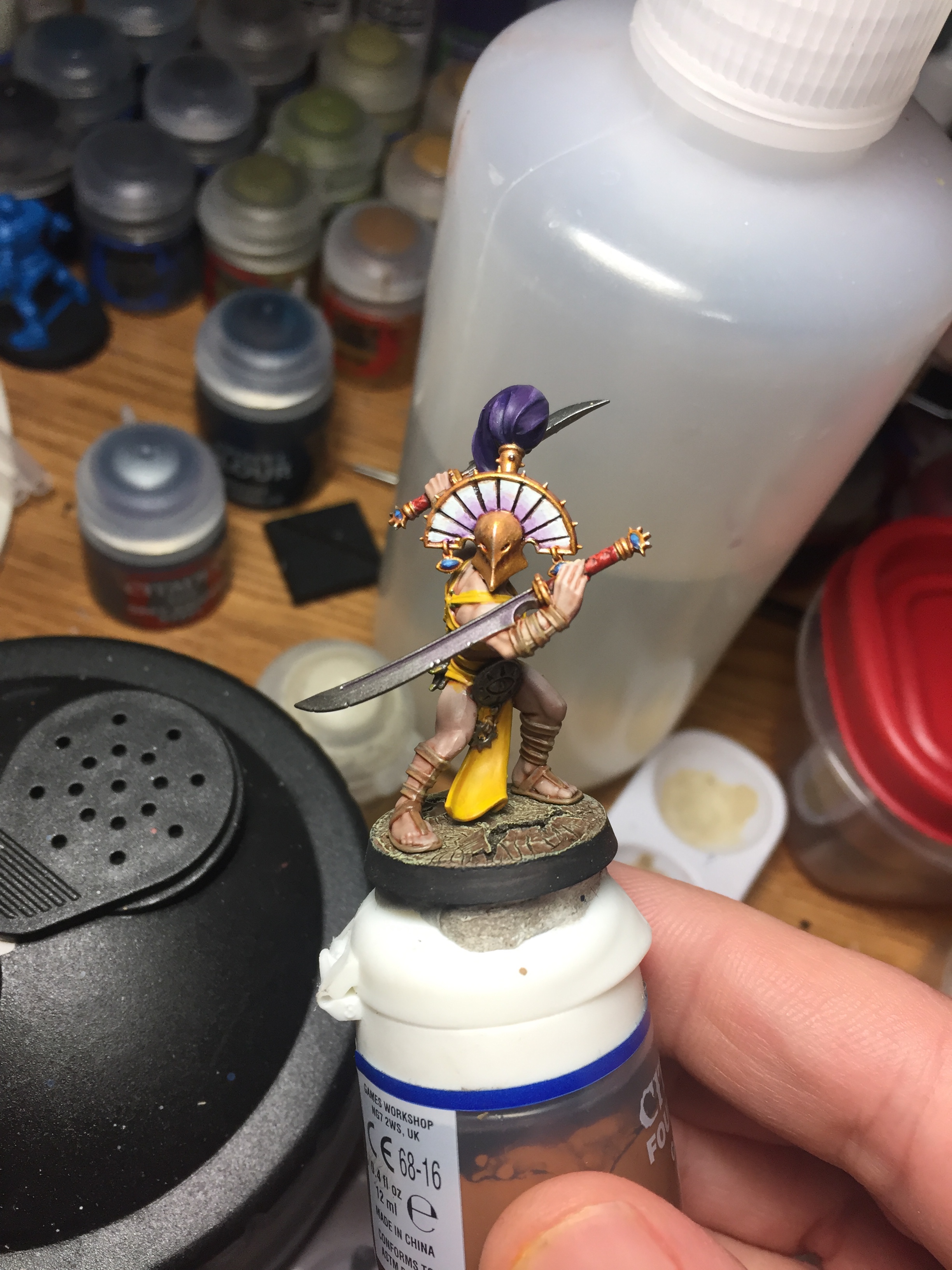
For the base I once again attempted to replicate Casey’s Warcy basing scheme and it was a total flop. I just don’t think we have the same colors even though they have the same name. It turned out really greenish and not what I hoped for. The crackle paint did work though so I was content to leave it as is. This was the third time I finished a Project Skin Tone model to completion, and I am pleased. Even with using the airbrush with zenithal spraying the airbrush isn’t the complete story. Using washes in the crevices helps get the contrast between clothing and skin which is essential when painting at this scale on the tabletop. The mid-range skin tone I think is a good one and I’ll probably be using it again in the future. My choice of blue perhaps wasn’t the best but I think switching to something darker in the future won’t make this foot soldier stand out too much. My gold paints where a pain to use. After months of storage, it took what seemed a lifetime of shaking to get them usable. Perhaps a look at some mechanical shakers is in the future. I hope you got some entertainment from this adventure. Let me know what you think of the color scheme. Does it seem sinister or is it just a normal looking outfit. As always obligatory glamor shots to close out my article, but I was a 9v battery short on my light box and they didn’t due the model justice.


Nice work, James. The sinister on this model comes from looking at it front-on at the “face” of the helmet, and to a far lesser extent, the pose. I don’t think painting can do much with it beyond making the model look good, and you certainly achieved that!
LikeLike
Thanks man.
LikeLike
This is great, I did not like these models when I first saw them but you have done a great job, the yellow / purple works really well as your colour wheel said it should!
LikeLiked by 1 person
Great Job, James. That purple fade on the helmet is fantastic.
LikeLike